Descripton
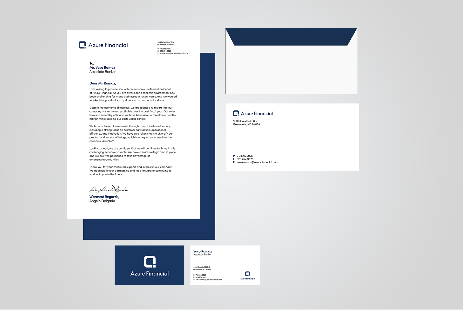
Azure Financial is a concept I created to improve my design skills.
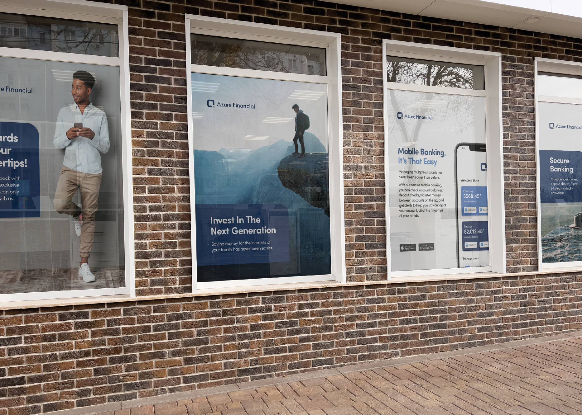
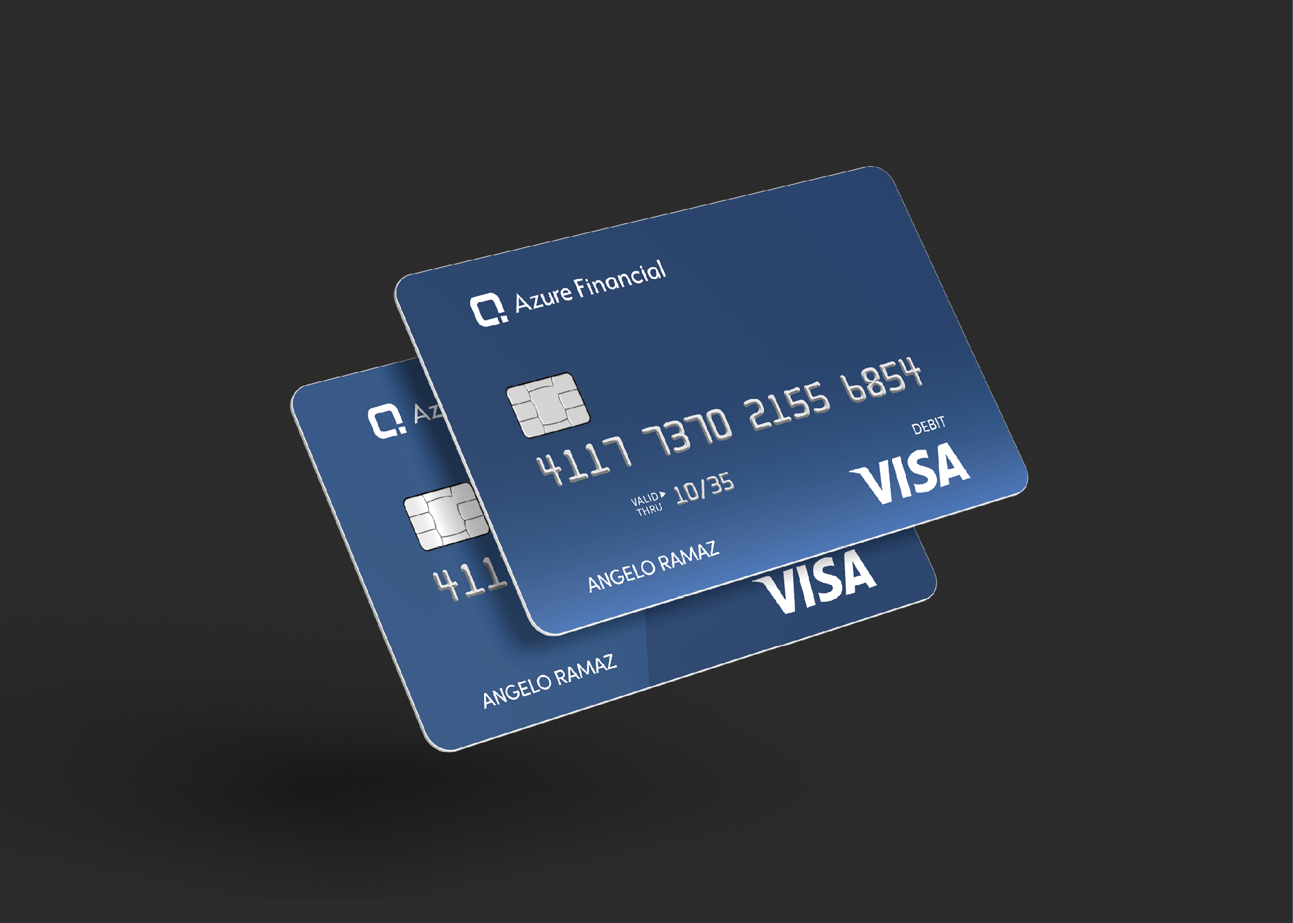
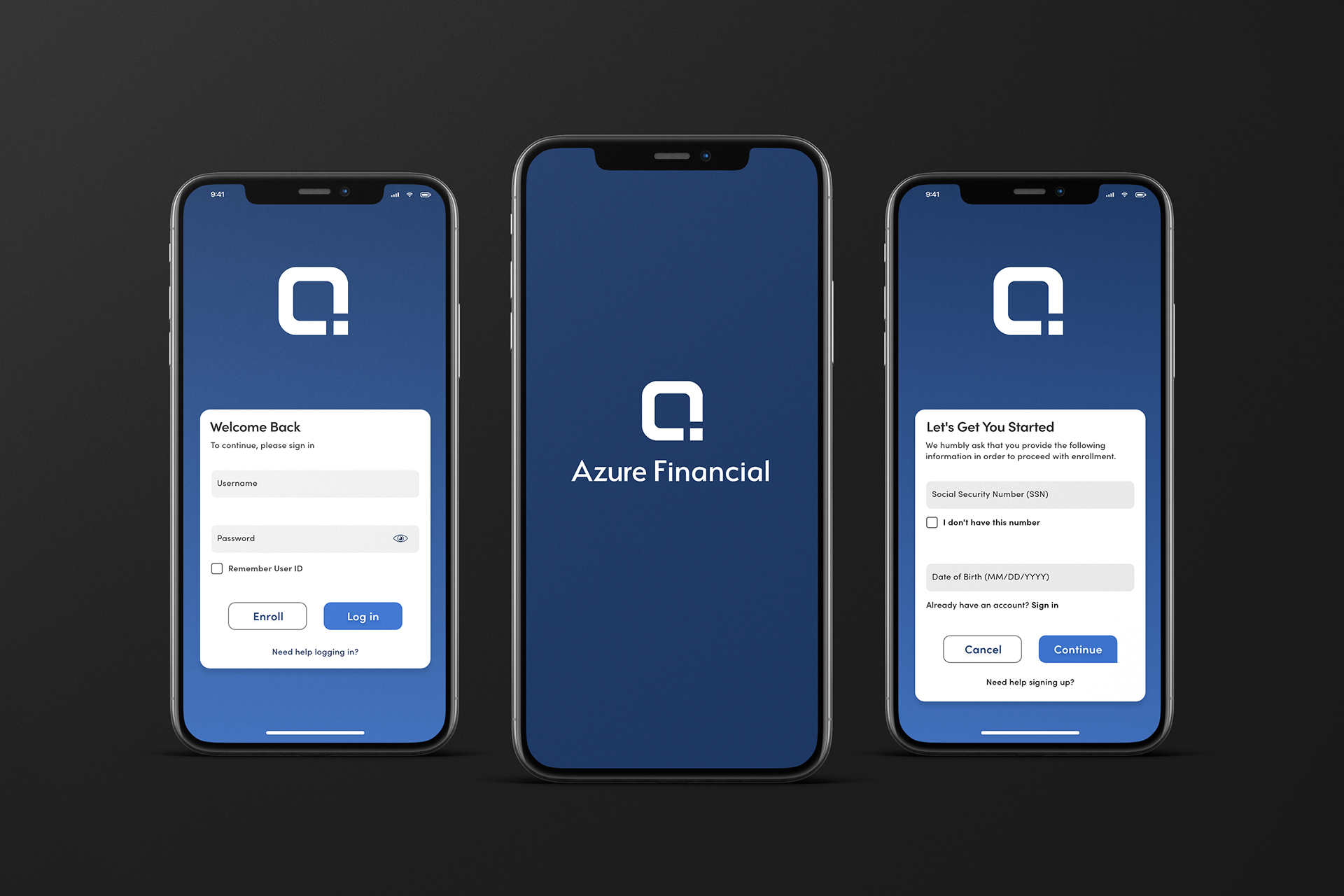
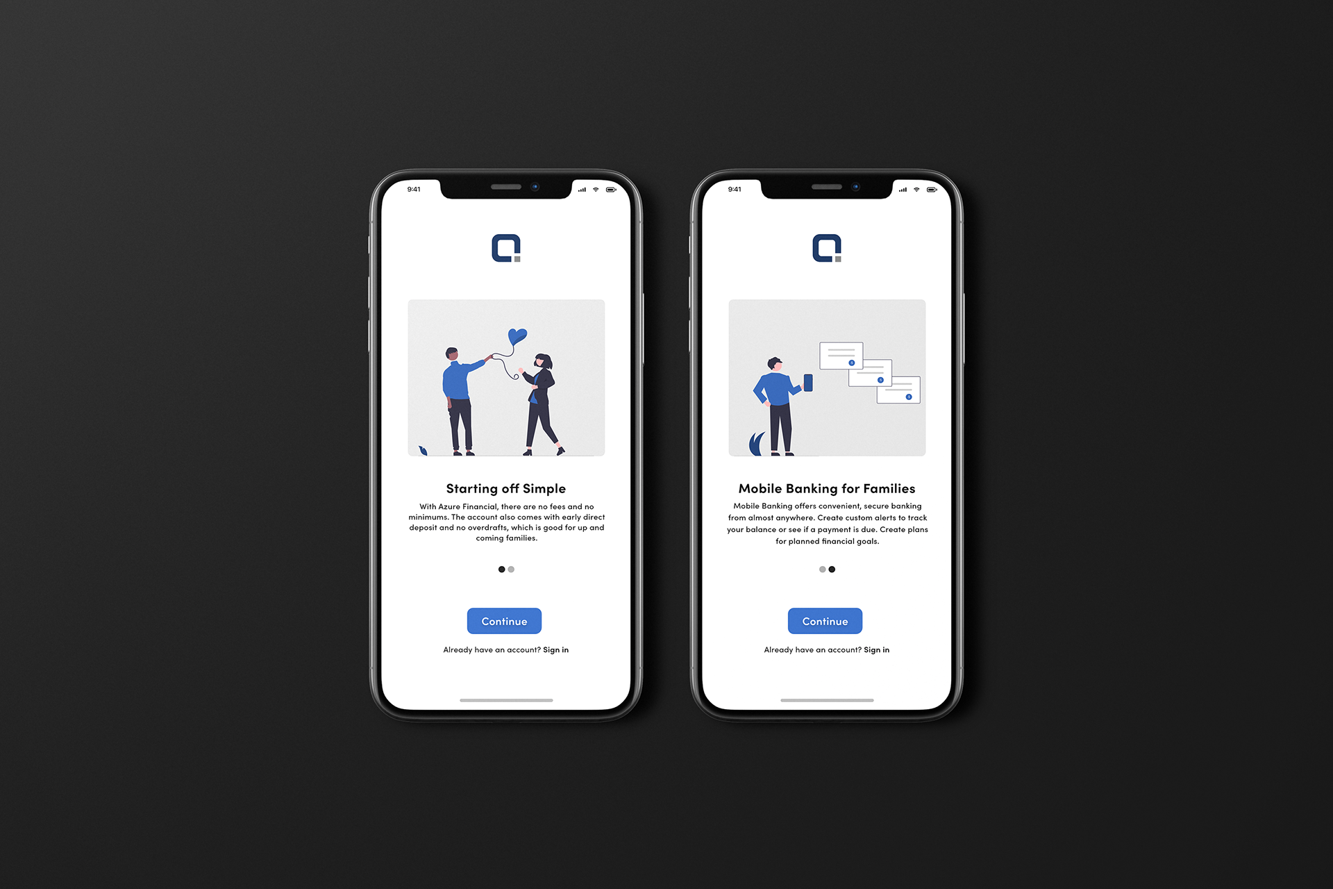
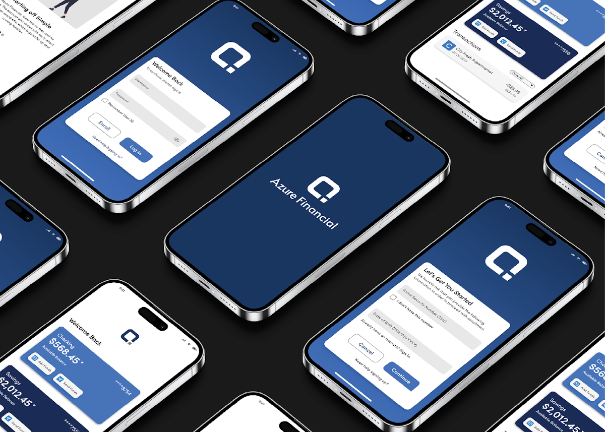
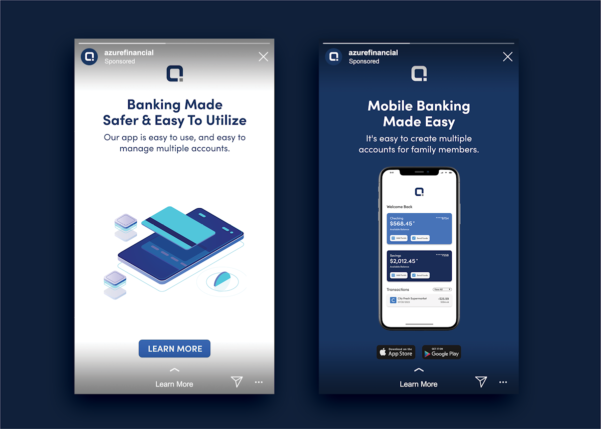
Azure Financial is a modern bank that aims to educate young families on making successful investments in the future. They provide a wide variety of banking products to make a family's financial life easier and stress-free.
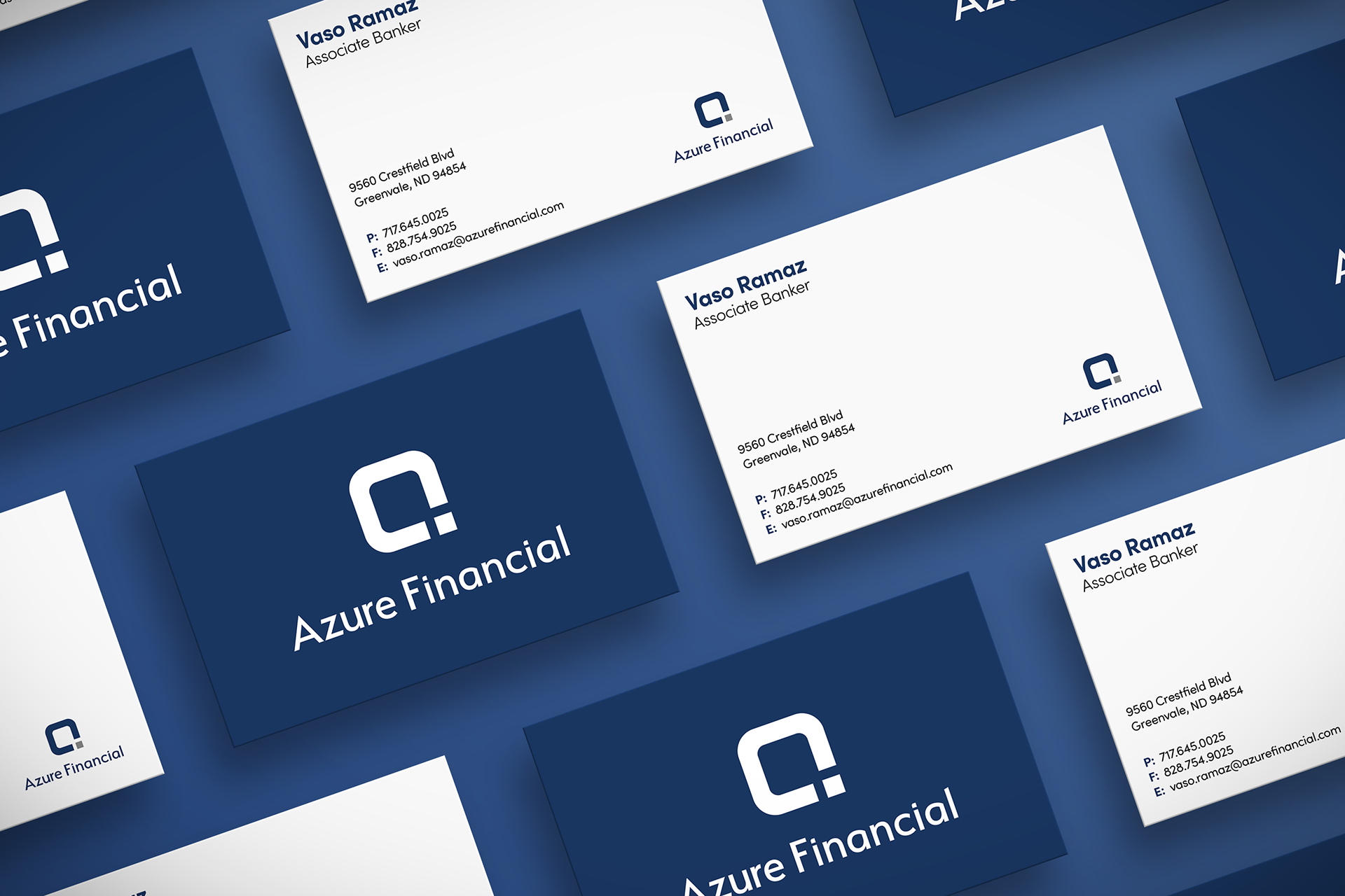
For this concept, a logo was needed to symbolize the values of the brand, such as foundation, family, connections, investments, and stability
Challenges
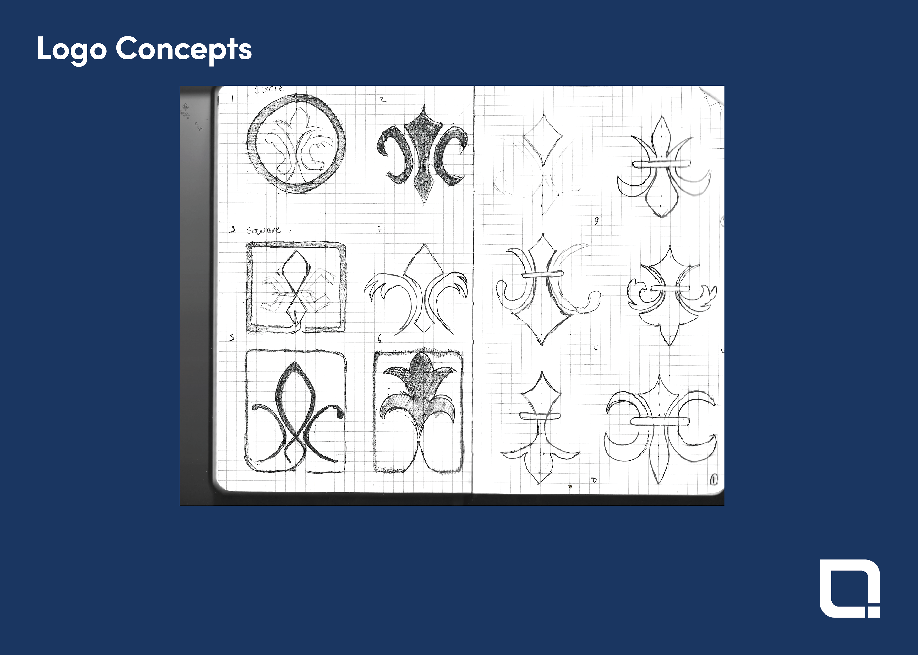
I originally started with a Fleur-de-lis symbol, as the emblem was long associated with trust. While that would have worked in the past, its dated appearance and complexity didn't fit the goal for a modern logo. This led me to adopt an iterative design approach, involving prototyping, testing, analyzing, and refining the logo requirements. This was needed to better align with brand values and audience perception.
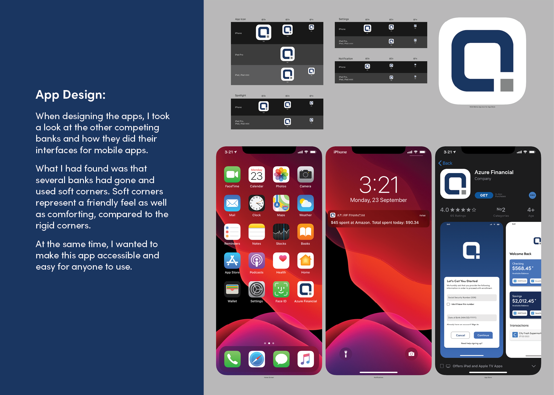
To refine my design strategy better, I studied various banking logos, noting common elements such as Color Choices (the color blue is often seen in many financial logos, frequently associated with professionalism and trust), Typography (many tend to use san-serif fonts, which are known for their modern and clean appearance), and Symbolism (Geometric shapes like squares and rectangles convey stability and reliability).
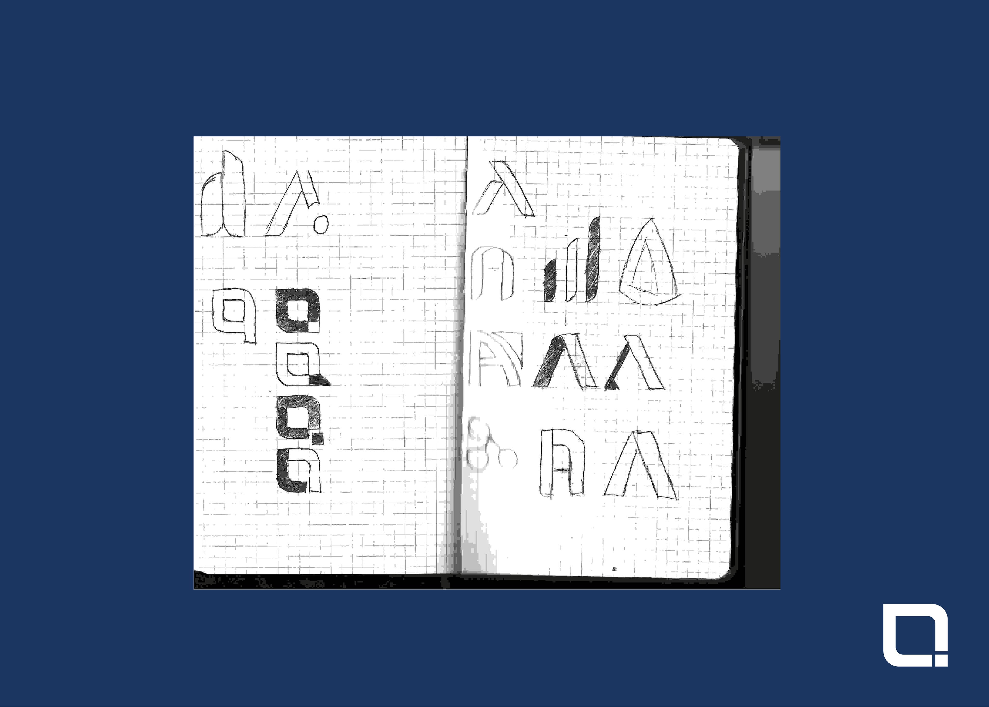
While doing this, I transitioned to the letter "A" as the central element, allowing for a more scalable and modern design. This approach aligns with trends in financial branding, where minimalist and geometric logos are prevalent.
Through A/B testing, I refined the design to ensure it effectively communicated the brand's values and resonated with the target audience.

Accomplishments
By working on this concept, I improved my branding skills. Undertaking this concept also showed me how important research is to developing a brand identity, its challenges, and the revisions needed to solidify that concept.